User experience (UX) is crucial in web design, ensuring visitors can navigate a site easily and enjoy their journey. However, the temptation to follow the latest design trends can sometimes overshadow these principles. While trendy elements may look appealing, they can inadvertently harm UX.
This article explores the balance between trendy design concepts and maintaining a seamless user experience. We’ll highlight how certain design choices, though fashionable, can disrupt usability and frustrate users. By understanding these pitfalls, we can create websites that are both beautiful and user-friendly.
The Allure and Risks of Trendy Designs
Just Because You Can, Doesn’t Mean You Should
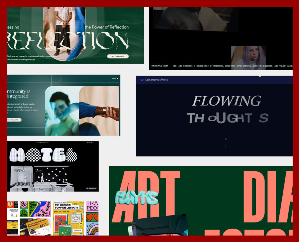
In the fast-paced world of web design, it’s easy to get swept up in the excitement of the latest trends. From sleek animations to bold typography and interactive elements, the appeal of incorporating these cutting-edge features into your website is undeniable. They promise to make your site look modern, innovative, and visually stunning.
However, just because you can incorporate these trendy elements doesn’t always mean you should. While they might look impressive, there’s a significant risk of overloading your website with too many features. This can lead to a cluttered, confusing user experience that detracts from the primary goal of your site: to serve your users effectively.
Just Because You Can, Doesn’t Mean You Should:
- Performance Problems: Heavy animations and interactive elements can slow down your site, leading to longer load times and frustrated users.
- Distraction from Content: Trendy designs can sometimes overshadow the actual content, making it harder for users to find the necessary information.
- Inconsistent User Experience: Incorporating too many different trends can create an inconsistent and disjointed user experience, leaving visitors confused and disoriented.
Common Trendy Design Pitfalls
Looks Aren’t Everything
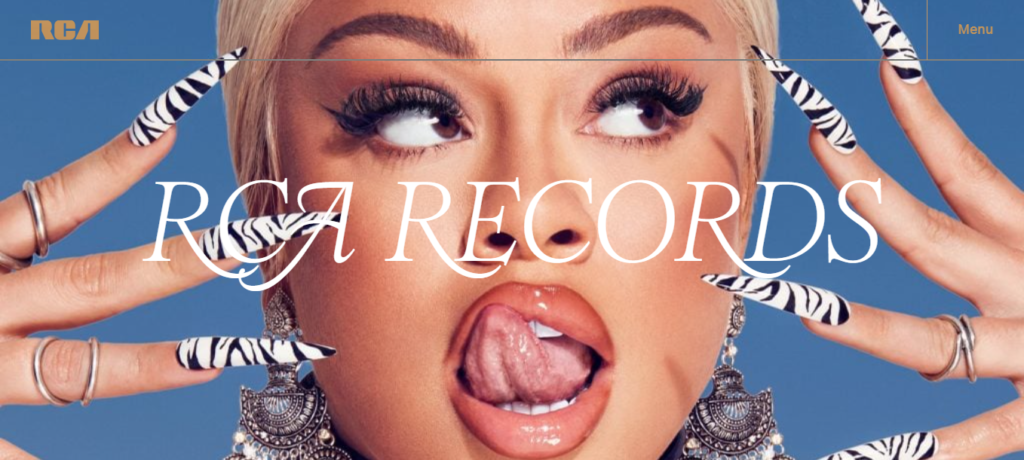
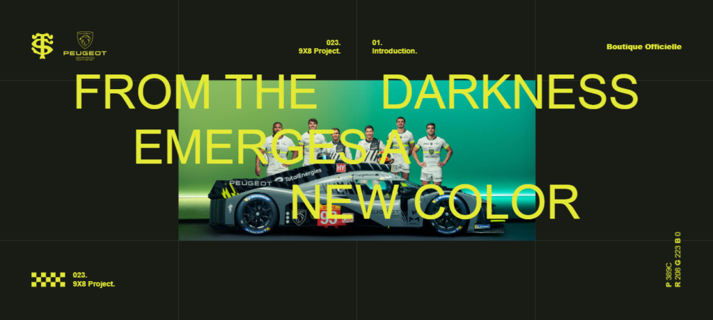
While visually stunning designs can capture attention and create a strong first impression, they don’t always translate to a positive user experience. Usability should always be a priority, as a beautiful website that is difficult to navigate or interact with can quickly frustrate users.
Examples of Trendy Elements That Hinder UX:
- Overly Complex Layouts: Intricate layouts can look impressive but may confuse users trying to find specific information.
- Heavy Use of Parallax Scrolling: This effect can be visually appealing but can also make it difficult for users to read content smoothly.
- Thin, Light Fonts: These fonts look clean and elegant but can be hard to read, especially on smaller screens or for users with visual impairments.
- Minimalist Designs with Insufficient Guidance: Sleek and modern, but if they lack clear navigation cues or sufficient information, users can feel lost.
- Brutalist Websites: Stark, unpolished aesthetics and unconventional layouts can sacrifice usability for style, leading to a confusing and frustrating experience.
Disruptive Transitions and Animations
source: wilderness destinations
Transitions and animations can add sophistication to a website, but when overused, they can disrupt the user’s flow. Excessive animations can slow down the browsing experience, forcing users to wait for effects to finish before they can interact with the content.
Frustration from Waiting for Animations and Excessive Scrolling:
- Loading Animations: Engaging but long-loading animations can test users’ patience.
- Scrolling Effects: Requiring users to scroll multiple times to reach the next section can be annoying and time-consuming.
- Hover Animations: Engaging but if too slow or overly complex, they can frustrate users who just want to click on a link or button quickly.
- Page Transition Effects: Long or overly elaborate transitions can slow down navigation and irritate users.
- Background Animations: Visually appealing but can be distracting and make it difficult for users to focus on the main content.
Horizontal Scrolling Issues
source: wilderness destinations
Most users are accustomed to vertical scrolling, so sections that scroll horizontally can be disorienting. This unexpected interaction can frustrate users who are trying to navigate the site intuitively.
Disorientation and Frustration for Users Expecting Vertical Scrolling:
- Horizontal Scrolling Sections: These can break the natural flow of reading and navigating, leading to a poor user experience.
- Unclear Affordances: Horizontal scrolling can be easy to miss or mistake for non-scrolling content if the affordances (visual cues) aren’t clear.
- Challenge for Non-Tech People: Users who are not tech-savvy may find horizontal scrolling particularly confusing and difficult to use.
- Inconsistent User Expectations: Users are generally accustomed to vertical scrolling, and horizontal scrolling can violate these expectations, leading to confusion and frustration.
Navigational Challenges
source: The Genius Club
Forcing users to click in multiple directions (right, left, up, down) to access content can make navigation cumbersome and confusing. A straightforward, intuitive navigation structure is essential for a positive user experience.
How This Makes Navigation Cumbersome and Confusing:
- Multi-Directional Navigation: This can lead to users feeling lost and frustrated, as they struggle to find the content they need.
- Hidden Navigation Elements: Navigation elements that are hidden behind icons or require multiple clicks to access can frustrate users who prefer straightforward access to information.
Typography and Readability Concerns
The Downside of Justified and Centered Text
Typography plays a crucial role in web design, significantly impacting readability and user experience. While justified and centered text can create a clean and organized appearance, they often come with drawbacks that can hinder readability.
Typography plays a crucial role in web design, significantly impacting readability and user experience. While justified and centered text can create a clean and organized appearance, they often come with drawbacks that can hinder readability.
Typography plays a crucial role in web design, significantly impacting readability and user experience. While justified and centered text can create a clean and organized appearance, they often come with drawbacks that can hinder readability.
Justify
Typography plays a crucial role in web design, significantly impacting readability and user experience. While justified and centered text can create a clean and organized appearance, they often come with drawbacks that can hinder readability.
Typography plays a crucial role in web design, significantly impacting readability and user experience. While justified and centered text can create a clean and organized appearance, they often come with drawbacks that can hinder readability.
How Justified Text Creates Uneven Spaces, Affecting Readability:
- Uneven Word Spacing: Justified text aligns both the left and right edges of a paragraph, which can create uneven spaces between words. This can make it difficult for users to read smoothly, as their eyes have to adjust to varying gaps between words.
- Rivers of White Space: The uneven spacing can also create “rivers” of white space running down the paragraph, which can be distracting and disrupt the reading flow.
How Centered Text Shifts the Beginning of Lines, Making It Harder to Read:
- Inconsistent Line Start: Centered text means that each line starts at a different point, which can make it harder for users to follow the text. This inconsistency forces the reader’s eyes to constantly adjust to new starting points, disrupting the natural reading flow.
- Reduced Readability: Centered text is best used for short lines, such as headings or quotes. For longer paragraphs, it can significantly reduce readability and make it challenging for users to engage with the content.
By understanding these typography concerns, designers can make more informed choices that enhance readability and provide a better user experience. Prioritizing readability over aesthetic alignment ensures that users can easily consume and engage with the content.
Striking the Right Balance
Balancing Aesthetics and Usability
source: Apple
Typography plays a crucial role in web design, significantly impacting readability and user experience. While justified and centered text can create a clean and organized appearance, they often come with drawbacks that can hinder readability.
How Justified Text Creates Uneven Spaces, Affecting Readability:
- Uneven Word Spacing: Justified text aligns both the left and right edges of a paragraph, which can create uneven spaces between words. This can make it difficult for users to read smoothly, as their eyes have to adjust to varying gaps between words.
- Rivers of White Space: The uneven spacing can also create “rivers” of white space running down the paragraph, which can be distracting and disrupt the reading flow.
How Centered Text Shifts the Beginning of Lines, Making It Harder to Read:
- Inconsistent Line Start: Centered text means that each line starts at a different point, which can make it harder for users to follow the text. This inconsistency forces the reader’s eyes to constantly adjust to new starting points, disrupting the natural reading flow.
- Reduced Readability: Centered text is best used for short lines, such as headings or quotes. For longer paragraphs, it can significantly reduce readability and make it challenging for users to engage with the content.
By understanding these typography concerns, designers can make more informed choices that enhance readability and provide a better user experience. Prioritizing readability over aesthetic alignment ensures that users can easily consume and engage with the content.
Understanding Your Audience and Goals
Knowing Your Target Audience
One of the most critical aspects of web design is understanding your target audience. Knowing who your users are and what they need can significantly influence your design decisions, ensuring that your website meets their expectations and provides a satisfying experience.
Importance of Being Aware of Your Target Audience and Their Preferences:
- User-Centered Design: Designing with your audience in mind ensures that the website is tailored to their needs and preferences. This can lead to higher engagement and satisfaction.
- Content Relevance: Understanding your audience helps you create content that resonates with them. Whether it’s the tone of your copy, the type of images you use, or the features you include, aligning these elements with your audience’s preferences can make your website more appealing.
- Design Choices: Different audiences have different expectations. For example, a website targeting young adults might benefit from a modern, dynamic design, while a site aimed at professionals might require a more formal and straightforward approach.
How the Overall Goal of the Page Should Guide Design Decisions
Every page on your website should have a clear goal, whether it’s to inform, entertain, sell, or engage. Understanding the primary objective of each page can help you make design choices that support that goal.
Guiding Design Decisions Based on Page Goals:
- Clarity and Focus: Ensure that the design of each page clearly communicates its purpose. Avoid clutter and distractions that can detract from the main objective.
- Call to Action (CTA): Design your CTAs to stand out and be easily accessible. Whether it’s a “Buy Now” button, a sign-up form, or a link to more information, the CTA should be prominent and compelling.
- User Journey: Consider the user journey and how each page fits into the overall flow of the website. Design elements should guide users smoothly from one step to the next, helping them achieve their goals without frustration.
By understanding your audience and aligning your design with the goals of each page, you can create a website that not only looks great but also effectively serves its purpose. This approach ensures that your design decisions are always user-focused and goal-oriented, leading to a more successful and satisfying user experience.
Conclusion
In web design, it’s essential to balance aesthetics with usability. While trendy designs can attract attention, they shouldn’t compromise user experience. Overly complex layouts, excessive animations, and unconventional navigation can frustrate users.
Prioritize content, simplify navigation, use animations sparingly, and maintain a consistent design language. Understand your audience and align your design with the goals of each page to ensure your website meets user needs and achieves its objectives.
Remember, trendy designs should enhance, not detract from, the user experience. Focus on usability and user satisfaction to create a website that is both beautiful and functional.


